Decipher Design Conference Microsite
Visual and Interaction design concept proposal for the Decipher Design Educators Conference organized by the American Institute of Graphic Arts (AIGA).
The 8 week project successfully delievered a microsite centered around graphical experimentation and user interactions was designed. The iterative process was content-driven and drew inspiration from a precedent designer's work to inform the site's concept and qualities.
The 8 week project successfully delievered a microsite centered around graphical experimentation and user interactions was designed. The iterative process was content-driven and drew inspiration from a precedent designer's work to inform the site's concept and qualities.
Microsite video walkthrough
Role
Visual Design, Content Design and Interation Design
Visual Design, Content Design and Interation Design
Team
Oliver taw, George Lin, Jerry Li and Raza Shabih-ul-Hassan
Oliver taw, George Lin, Jerry Li and Raza Shabih-ul-Hassan
Duration
8 Weeks, Spring 2023
8 Weeks, Spring 2023
Final Deliverables and Project Overview
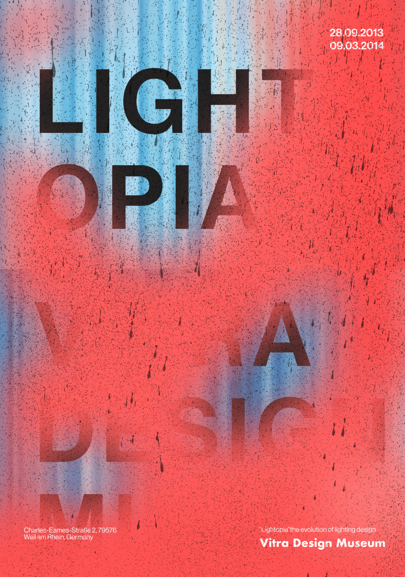
week 1 experimentation
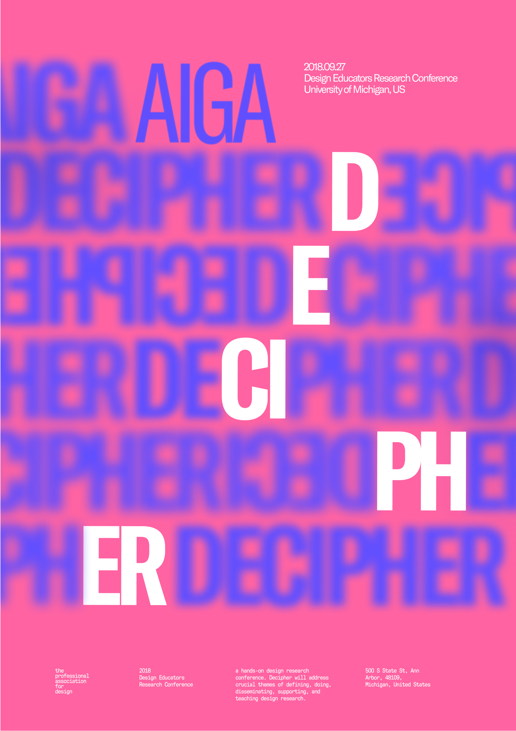
week 3 iteration

week 5 converging
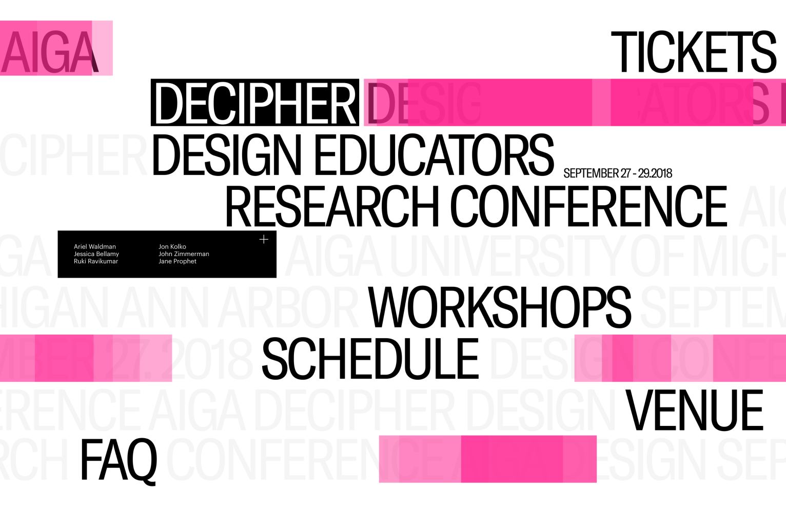
week 6 graphic to screen
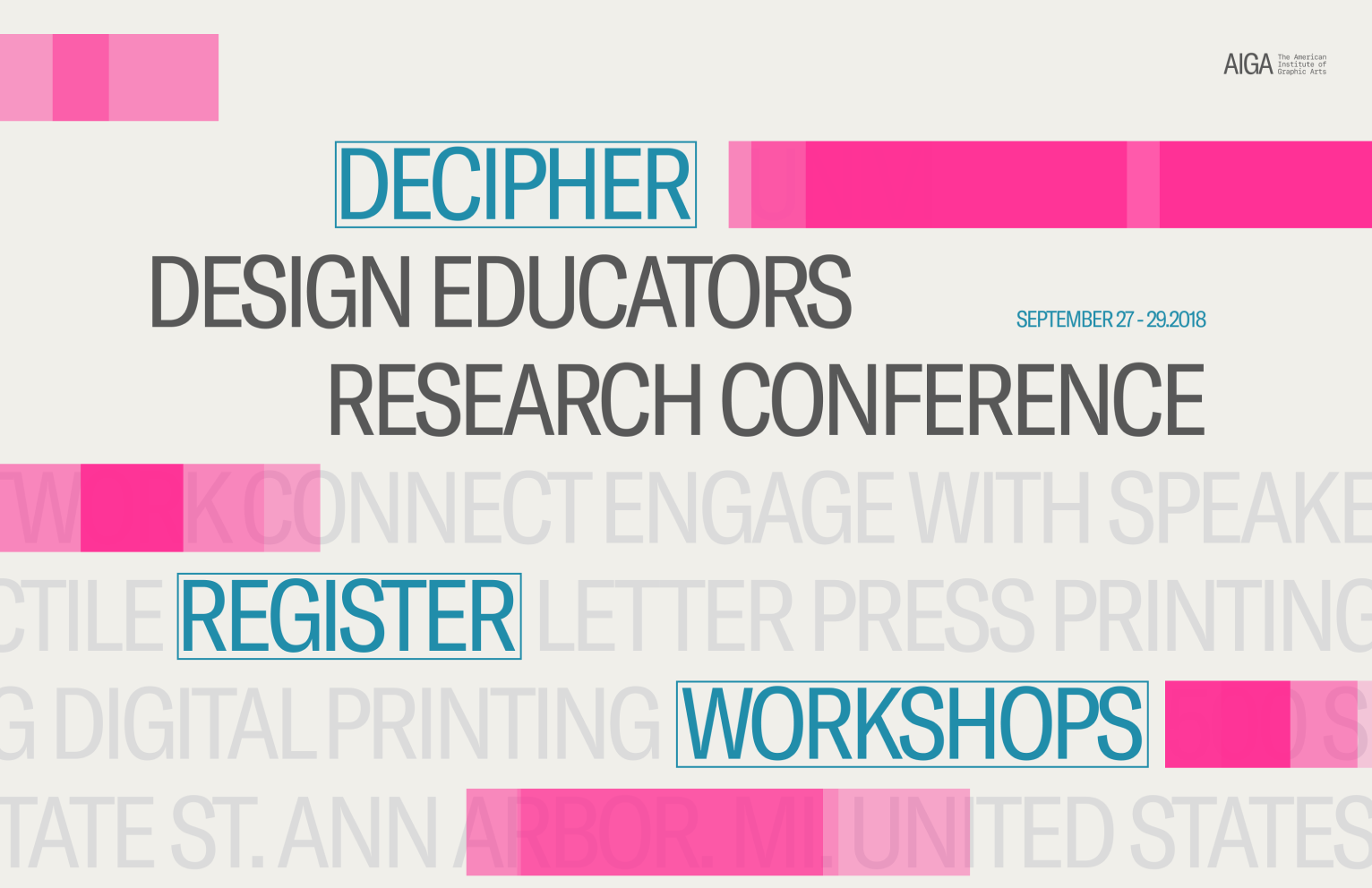
week 8 final microsite
Visual Design
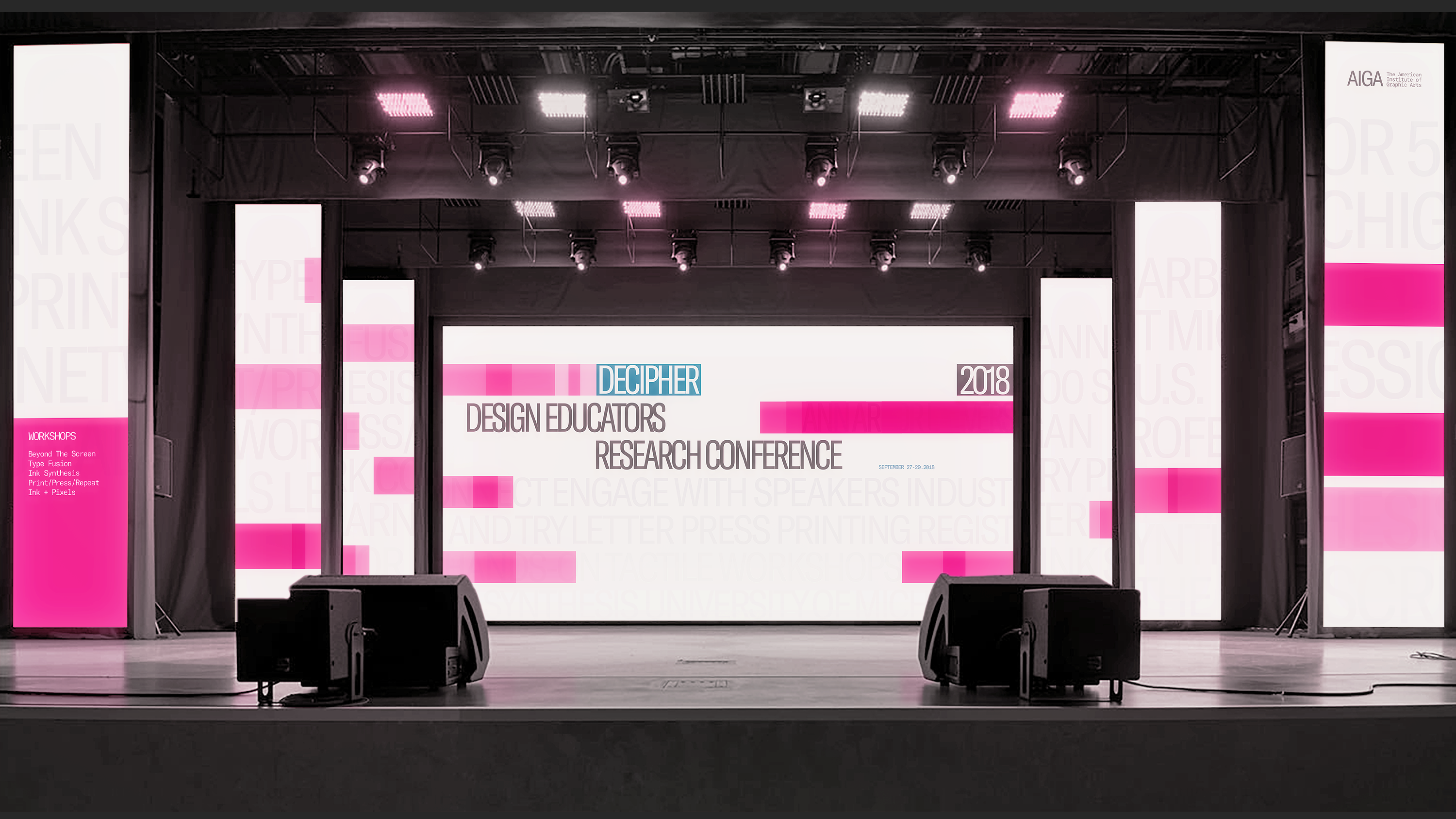
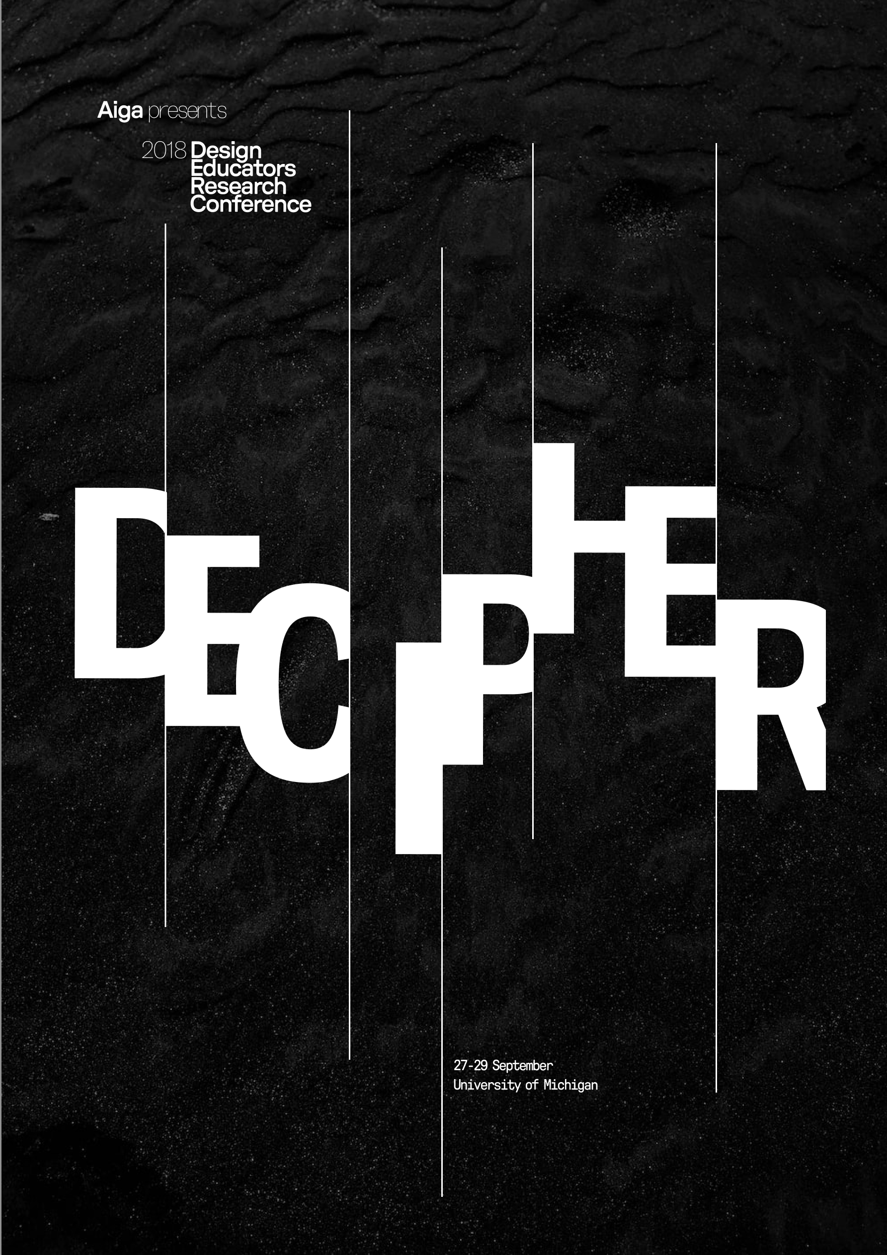
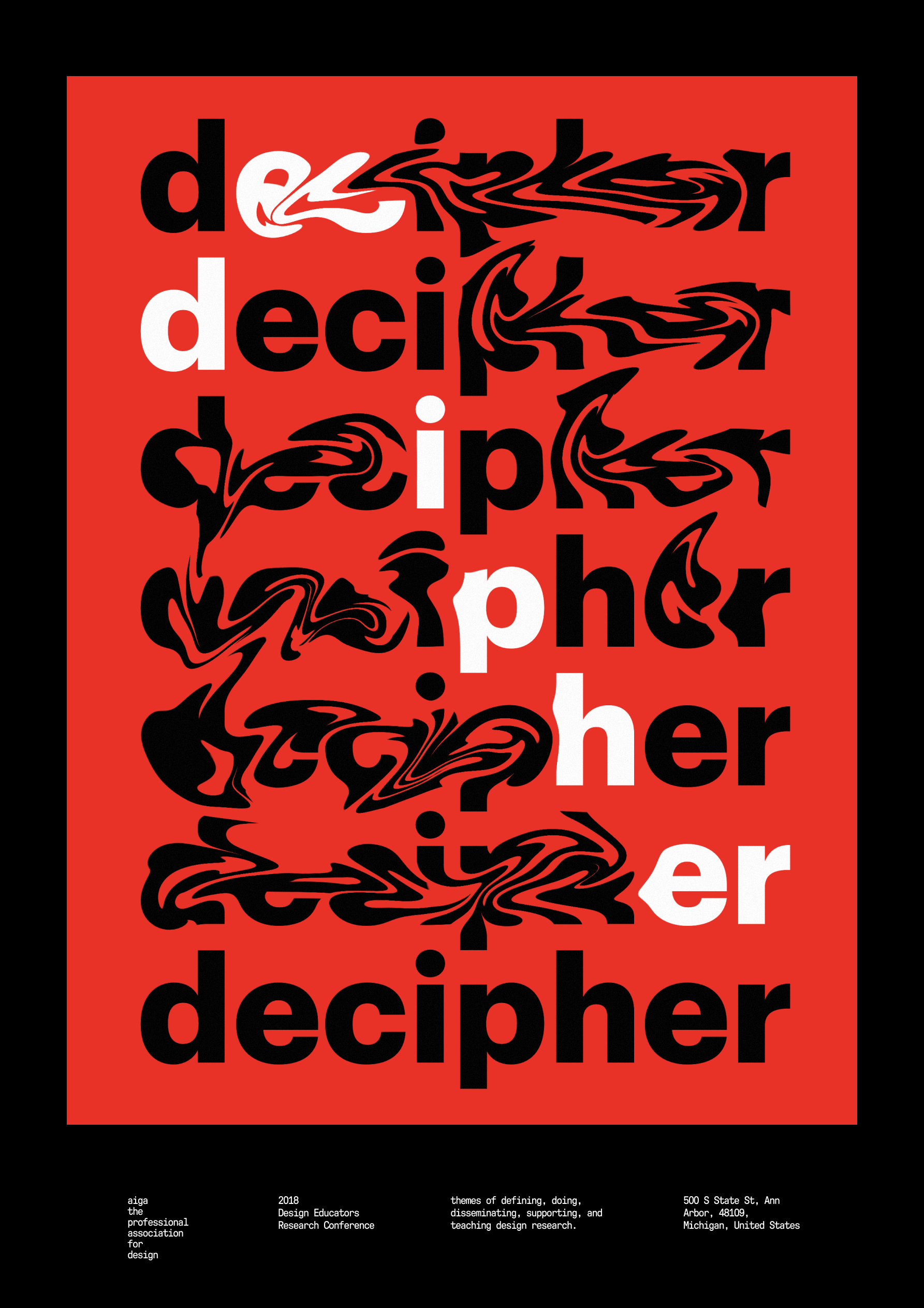
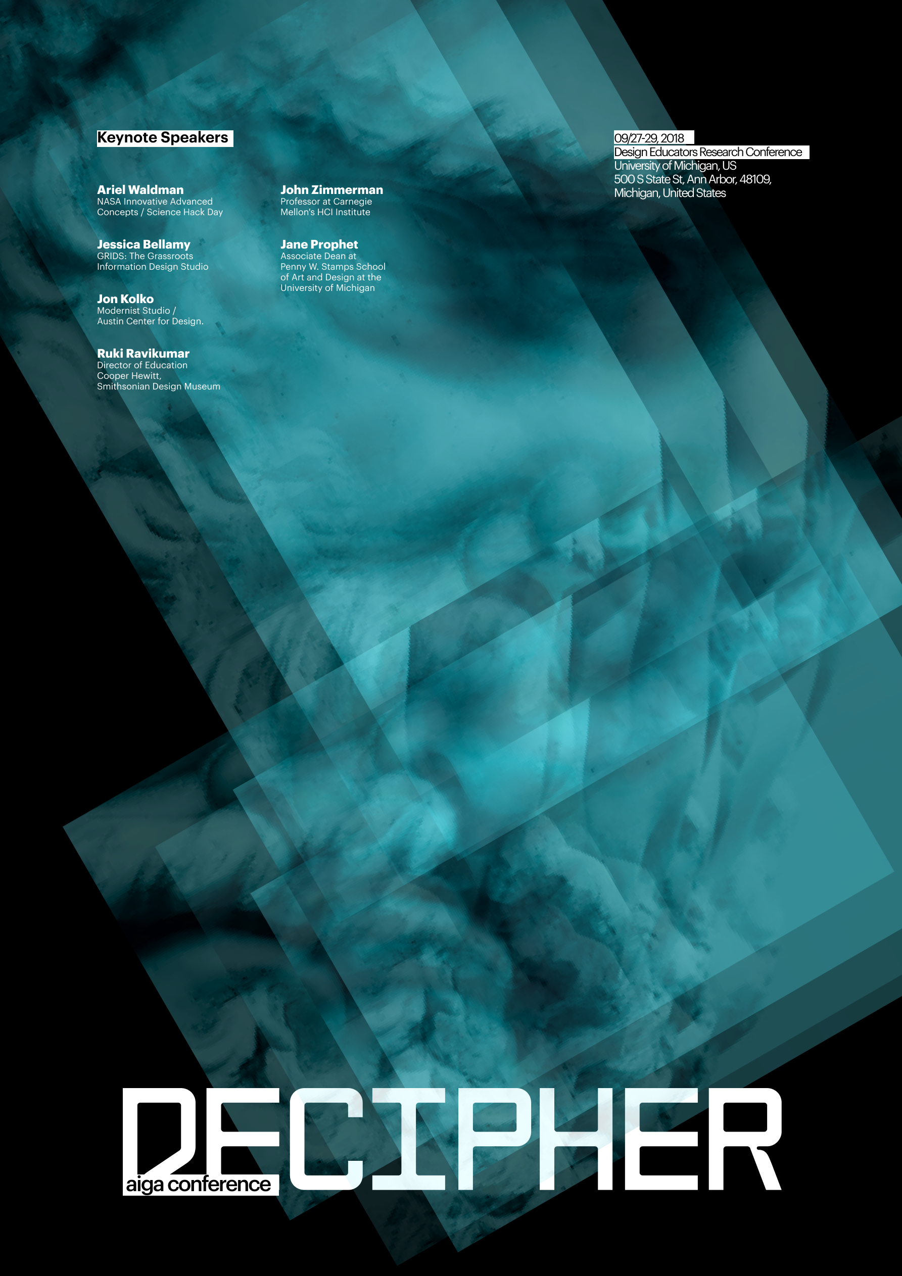
Using an iterative process informed by the design qualities of the precedent, Chris Ashworth. Emphasizing on the qualities of “blending layers with opacity and visual variance through repetition”. Hence, designing graphic assets such as event posters and mockups.
![]()
![]()
![]()
![]()
![]()
![]()
Driven by content not just ideas


The Decipher event offers workshops on both traditional and digital-to-letterpress printing. The main objective of these workshops is to provide participants with a comprehensive understanding and appreciation of the tactile quality and artistic expression inherent in traditional letterpress printing.

Letterpress printing machine
How might we
Create a pre-event microsite that effectively generates curiosity among first-time users, including designers, and hobbyists to inspires them to register for workshops?
Guiding Principles
Familiarity as concept
Inspired by the concept of letterpress printing, the microsite was created to familiarise users with its unique concept. Before the advent of digital printing, letterpress printing was the primary method used to produce prints. This approach involves layering ink and repeating images or patterns to create a distinctive and intricate texture.
![]()
final microsite design
Inspired by the concept of letterpress printing, the microsite was created to familiarise users with its unique concept. Before the advent of digital printing, letterpress printing was the primary method used to produce prints. This approach involves layering ink and repeating images or patterns to create a distinctive and intricate texture.

final microsite design


letterpress image grouping
Content Strategy
Shades of Expression
Shades of pink and cyan were used throughout the site as a nod to the traditional CMYK registration marks used in printing. Pink adds depth and dimension to the pages, while cyan draws attention to the main interactive elements.
This creates visual contrast against the beige background, which creates a sense of dynamism and movement, encouraging the users to further interact with the site.
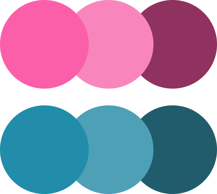
Primary Colours

CMYK registration mark
Cohesive Imagery
The site's images were treated with pink and grey filters in reference to the CMYK colors. Pink was chosen to enhance contrast and highlight notable images, while the grey filter referenced traditional vintage images. This use of a consistent color scheme throughout the site helps to reinforce its visual identity and create a cohesive user experience.
![]()
Treated Images
The site's images were treated with pink and grey filters in reference to the CMYK colors. Pink was chosen to enhance contrast and highlight notable images, while the grey filter referenced traditional vintage images. This use of a consistent color scheme throughout the site helps to reinforce its visual identity and create a cohesive user experience.
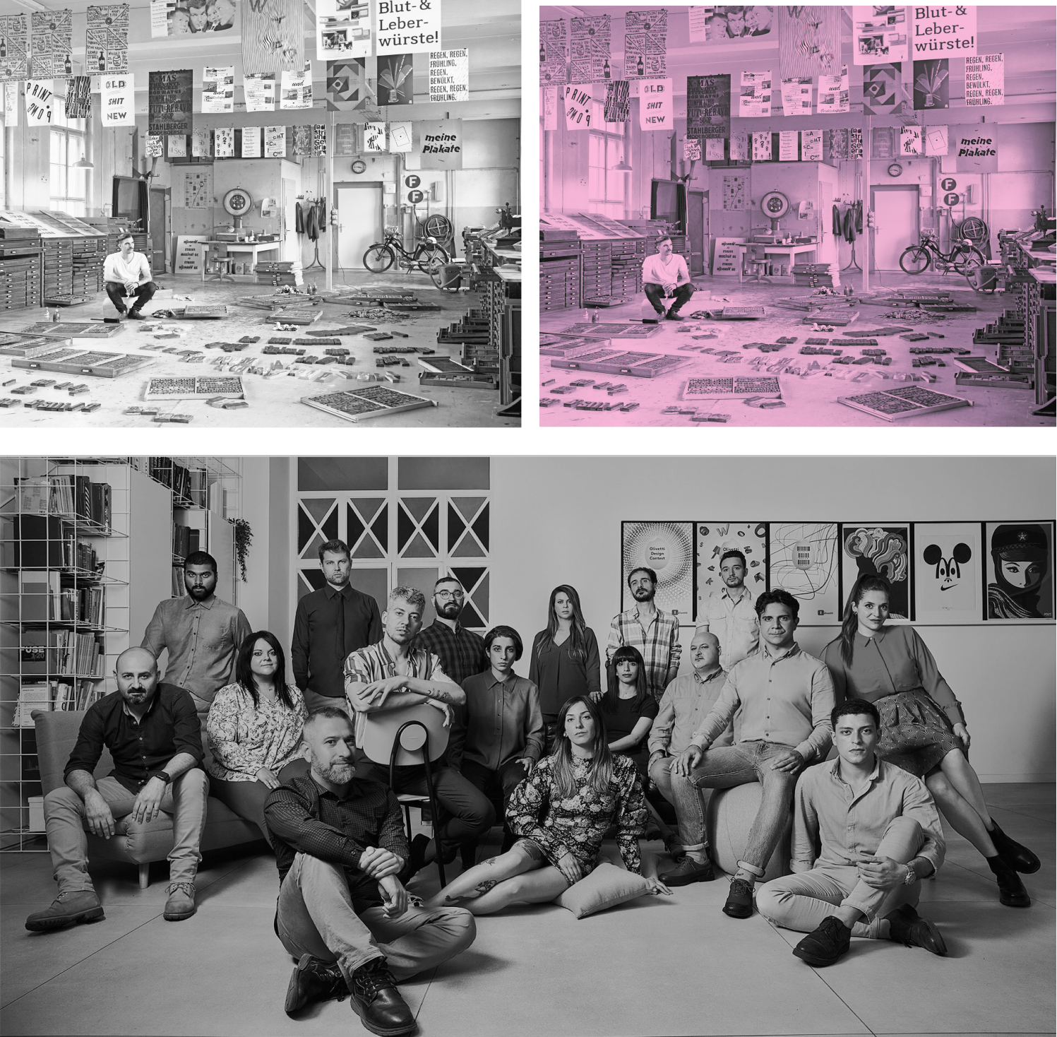
Treated Images
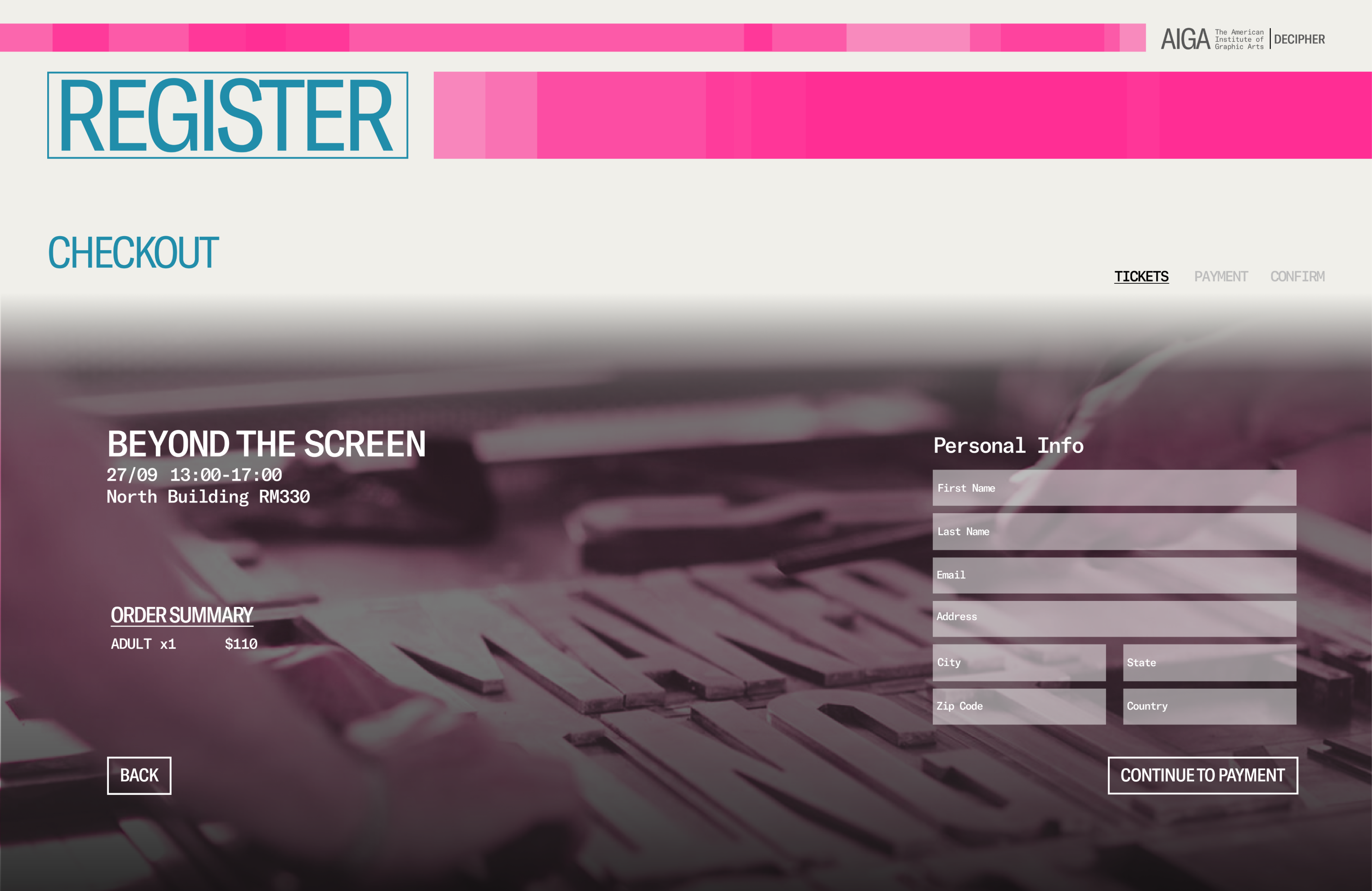
Workshop register page
Typography
![]()
GT America Condensed's narrow and compact design references the crowded and tall nature of traditional letterpress type blocks. Its tight letter spacing and narrow character width make it suitable for fitting more characters in a single line.
![]()
The lowercase letters’ x-height of GT America Mono is relatively large compared to the uppercase letters which makes the text easier to read. The rectilinear serifs lend an allusion to typewriter copy, further taking advantage of the letterpress inspiration.
Font Pairing
GT America Mono's ample negative space between characters enhances legibility, while GT America Condensed's tight spacing creates a clear visual hierarchy. Both fonts share a similar sans-serif font anatomy, creating a cohesive and unified look.

GT America Condensed's narrow and compact design references the crowded and tall nature of traditional letterpress type blocks. Its tight letter spacing and narrow character width make it suitable for fitting more characters in a single line.

The lowercase letters’ x-height of GT America Mono is relatively large compared to the uppercase letters which makes the text easier to read. The rectilinear serifs lend an allusion to typewriter copy, further taking advantage of the letterpress inspiration.
Font Pairing
GT America Mono's ample negative space between characters enhances legibility, while GT America Condensed's tight spacing creates a clear visual hierarchy. Both fonts share a similar sans-serif font anatomy, creating a cohesive and unified look.
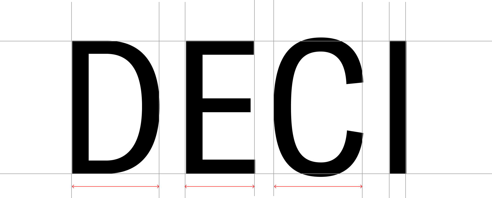
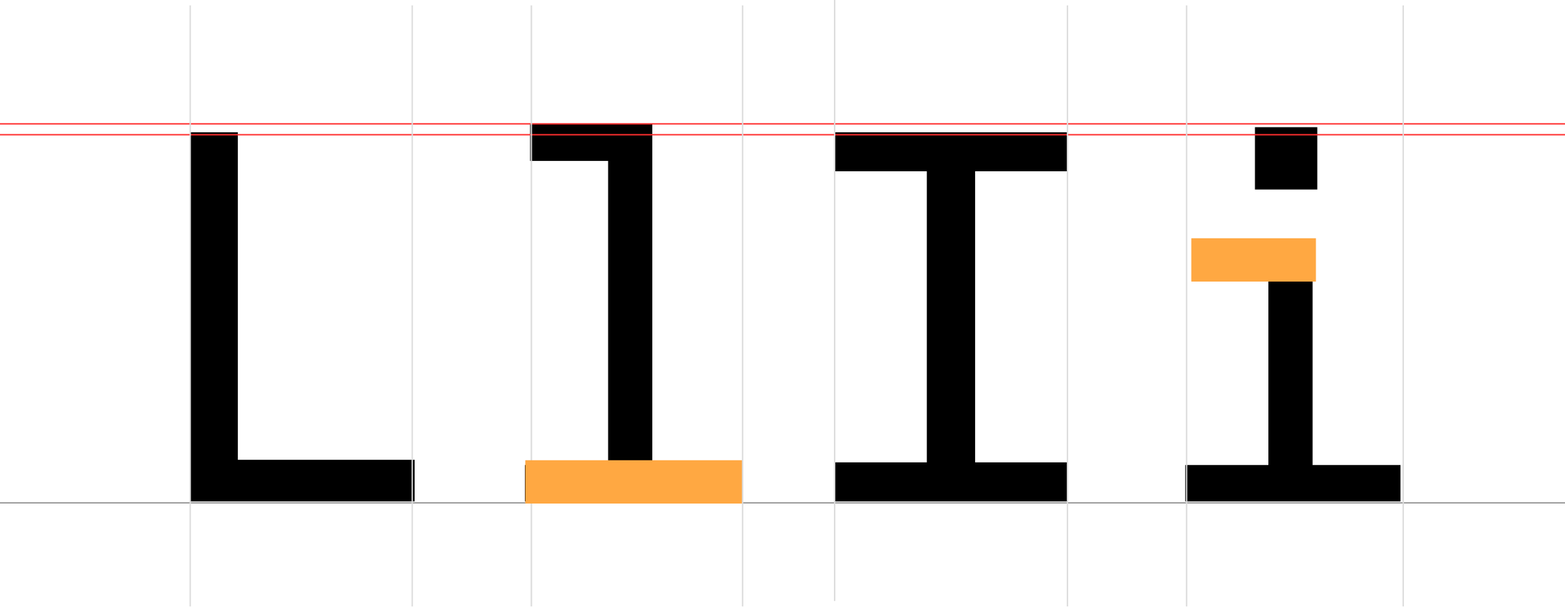

Font Pairing, “About us page”
User Flow

Landing Page
The site's images were treated with pink and grey filters in reference to the CMYK colors. Pink was chosen to enhance contrast and highlight notable images, while the grey filter referenced traditional vintage images. This use of a consistent color scheme throughout the site helps to reinforce its visual identity and create a cohesive user experience.

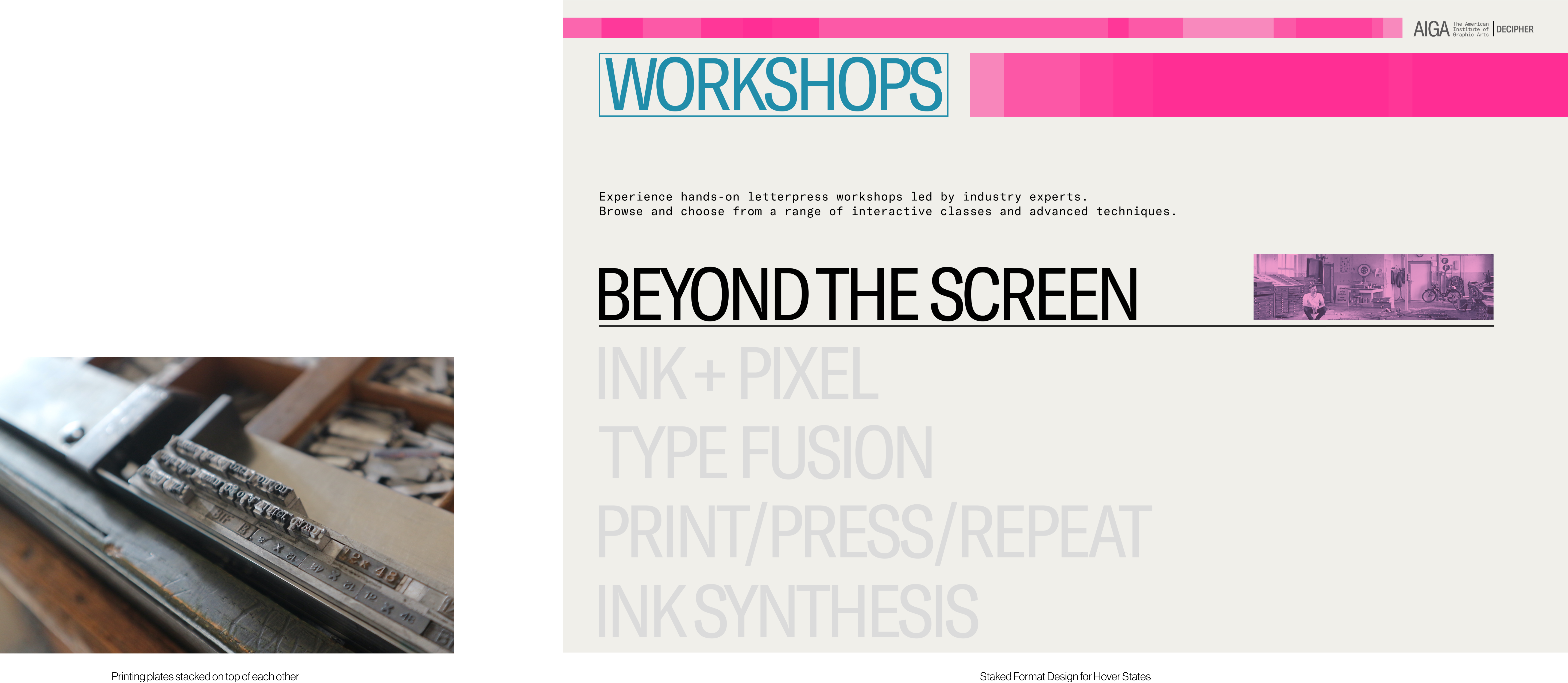
Workshop selection page
Different workshops are displayed in a stacked format, allowing for quick and easy previewing. This stacked format design refers to the way that printing plates are stacked on top of each other to create a multi-layered design.
Registration page
The registration page layout is inspired by the 'California Job Case', a method of organizing letters in a wooden case used to store movable type. The workshop cards are arranged in an offset manner, inspired by the modular design of wooden type cases, where frequently used letters are stored in larger compartments for easy accessibility.

Checkout page
The checkout page progress interaction extends the use of the CMYK filter (video below). By associating the image on each checkout step with its respective color of Cyan, Magenta, Yellow, the user is guided to the final confirmation page with the Key color. This provides a cohesive and visually engaging checkout experience that helps users navigate through the process with ease.

Micro-Interactions design decisions driven by content
Rollover Highlight on Hover
Users can hover over the buttons and this will highlight the button with color in a rollover effect as used traditionally to distribute the ink.
Page Transition
The method of transitioning between the landing page to the workshop page draws inspiration from printing machines, highlighting the relationship between traditional and digital methods.
Text Color Fill on Hover
Hovering over the textbox fills color on text which is based on the screen-printing technique where a mesh is used to transfer ink onto a surface.
Reflection
This project was a testament to resilience and determination as our team continuously faced challenges week after week. Despite the hurdles, we refused to give in and, through countless hours of brainstorming, we managed to turn the project around.
Over the course of this project, I had the opportunity to significantly enhance my visual design skills through continuous expansion and refinement. The iterative process taught me the importance of perseverance and attention to detail. Additionally, I delved into the realm of converting near-obsolete print designs into digital formats, allowing me to explore content-driven projects and gain valuable experience in this domain.
I am incredibly grateful to Professor Russell Taylor for his invaluable critique sessions and his unwavering commitment to pushing our team's creative boundaries. His guidance and constructive feedback played a crucial role in our project's success, and I am thankful for the opportunity to learn and grow under his mentorship.